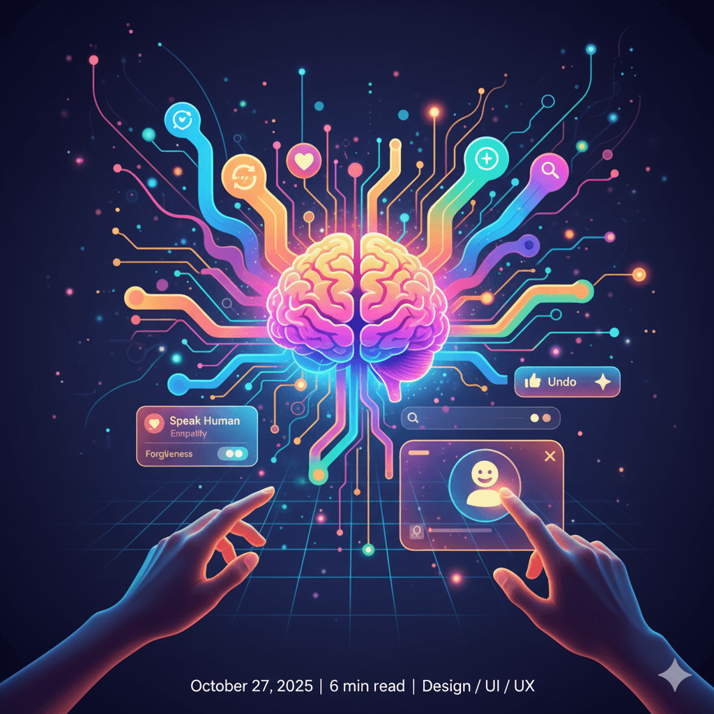
More Than Pixels: How to Craft Emotionally Intelligent Interfaces
The best apps don't just work—they feel right. Discover the principles of empathetic design that build trust, delight users, and create a truly human connection.
We've all been there: staring at a cold, confusing error message, struggling with a clunky checkout process, or feeling lost in a maze of menus.
A functional app can still be a frustrating one.
The difference between an interface that merely works and one that feels intuitive, supportive, and even delightful is emotional intelligence.
The difference between an interface that merely works and one that feels intuitive, supportive, and even delightful is emotional intelligence.
Design is no longer just about arranging pixels and choosing colors; it's about anticipating and responding to human feelings.
Emotionally intelligent design goes beyond aesthetics and usability to build empathy, trust, and a genuine connection with the user. It’s the art of making technology feel less like a machine and more like a helpful partner.
So.... How do we get there?
It comes down to a few core principles.
1. Speak Human: Clarity and Empathy in Your Copy
The words your interface uses matter—a lot. Cold, robotic language can make users feel anxious or foolish, especially when something goes wrong. Empathetic copywriting builds trust and reassures the user.
Consider an error message:
Cold & Robotic:
Error #5001: Authentication failed.
Warm & Human:
🙀 Oops! That password doesn’t look right.
Please try again, or we can help you reset it. 👍
Please try again, or we can help you reset it. 👍
The second example does more than state a problem. It takes the blame ("Oops!"), offers a clear next step, and provides a helpful escape route ("reset it"). It acknowledges the user's frustration and guides them forward.
2. Design for Forgiveness: Make 'Undo' Your Best Friend
Humans are not perfect. We click the wrong button, make typos, and change our minds. An emotionally intelligent interface doesn't punish these mistakes; it gracefully accommodates them.
Destructive Actions: For actions like deleting a file or canceling an account, a clear confirmation modal is crucial. ("Are you sure you want to permanently delete this project? This action cannot be undone.")
Reversible Actions: The "undo" snackbar in Gmail after sending an email is a classic example. It provides a small window of opportunity to reverse a potentially significant mistake, offering immense peace of mind.

When users know they can easily recover from an error, they feel more confident and are more willing to explore your application.
3. Create Moments of Delight: The Power of Micro-interactions
Functionality gets the job done, but delight makes the experience memorable. Micro-interactions are the small, often animated, moments of feedback that acknowledge a user's action and make the interface feel alive and responsive.
Think about:
The satisfying "pop" and animation when you "like" a post.
The smooth transition when an item is added to your shopping cart.
The playful animation in a pull-to-refresh action.
These small details serve no major functional purpose, but they infuse personality into the interface, show a high level of craft, and reward the user for their interaction, turning a mundane task into a small moment of joy.
The Tools That Enable a Human Touch
Modern design tools are essential for crafting these emotionally intelligent experiences. They allow for rapid iteration and testing, which is key to understanding how a design feels in practice.
Figma & Framer: These tools have moved beyond static mockups. Their advanced prototyping features allow designers to simulate complex animations and user flows. This is where you can test a micro-interaction to see if it feels delightful or distracting, long before any code is written.
Design Systems & TailwindCSS: Consistency is a cornerstone of trust. A design system ensures that buttons, forms, and messages look and behave predictably across the entire application. Tools like TailwindCSS help enforce this consistency efficiently, so the user always feels like they are in a familiar, reliable environment.
Conclusion: Design is a Conversation
Ultimately, crafting an emotionally intelligent interface is about treating design as a conversation with your user. Is your interface a patient teacher or a stern lecturer? Is it a helpful guide or a confusing map?
The goal isn't to create technology that has emotions, but to create technology that respects human emotions. By focusing on empathy, forgiveness, and delight, we can build digital products that don't just look good—they build relationships.